Plusone Social
Company: Titan AI Studios, Inc. is a company that creates multiple applications, one of them being PlusOne Social, a mobile app that helps users find friends.
Role: UX/UI Designer & Marketing
This was one of my first UX/UI project as a job, which was extremely difficult being the only designer at the time, as I was still new. As I've grown throughout my career and understanding my process a lot more, there were things I wish I could do better with this project, such as continuously asking why and interviewing our users.
My UX Design Approach -- What I could've done
📌 This was one of my first UX/UI project as a job, which was extremely difficult being the only designer at the time, as I was still new. As I've grown throughout my career and understanding my process a lot more, there were things I wish I could do better with this project:
👞 Empathize
🚩 What I could've done:
- understand more of what the main goal is, such as why are we wanting to reskin the app?
- talk with the users, what is something they dislike about the app
- ask open-ended questions to our users
- create my hypothesis (e.g. We believe if reskinning the app for our users, it will achieve a better feel that creates a "happier" vibe, therefore, users will be more likely to engage more on the app.)
🚩 What I could've done:
- look for a common pattern based on user interviews
- create personas based on the findings
- How might we go about this or that
🚩 What I could've done:
- brainstorm ideas
- draw out multiple scenarios
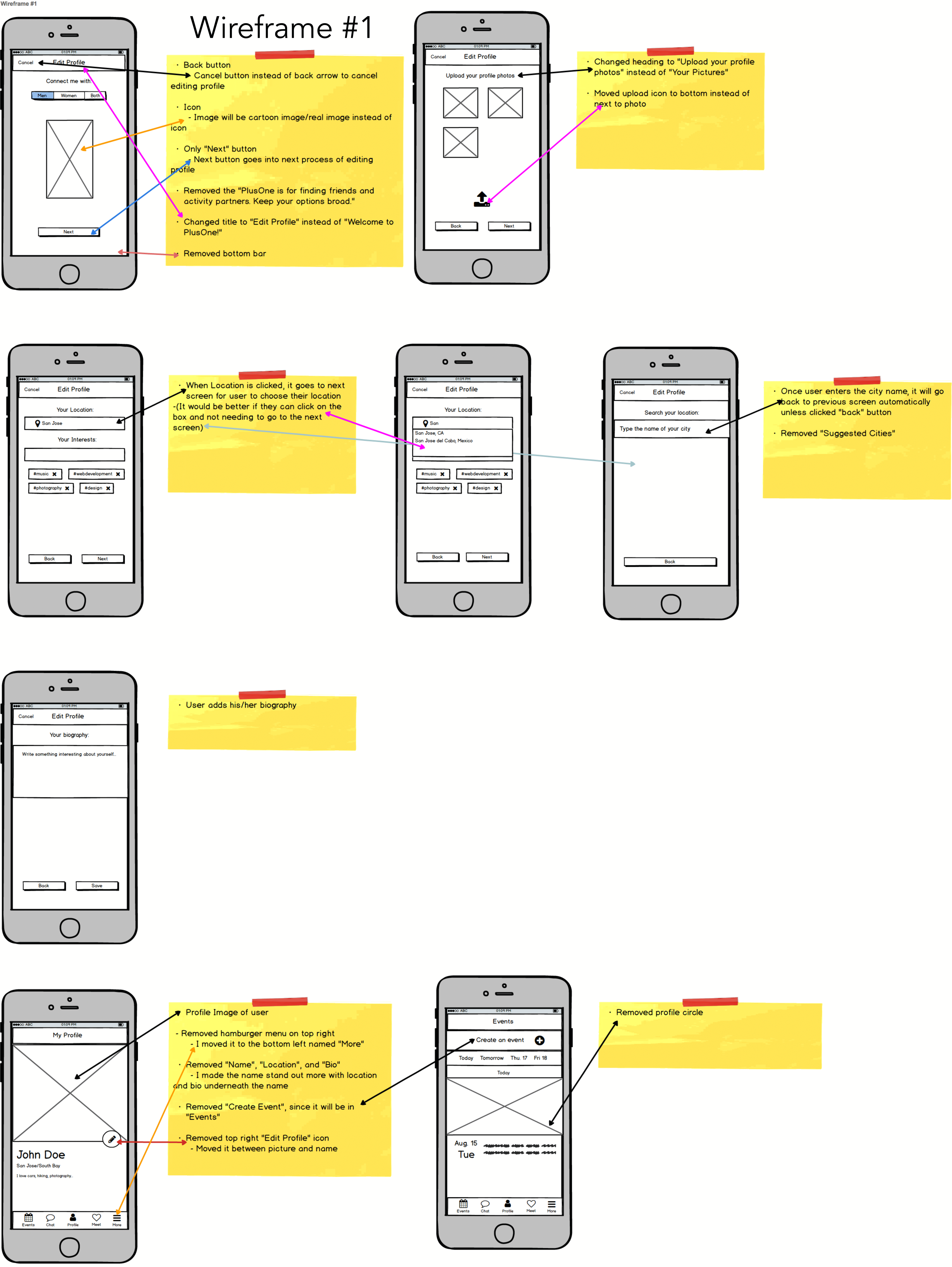
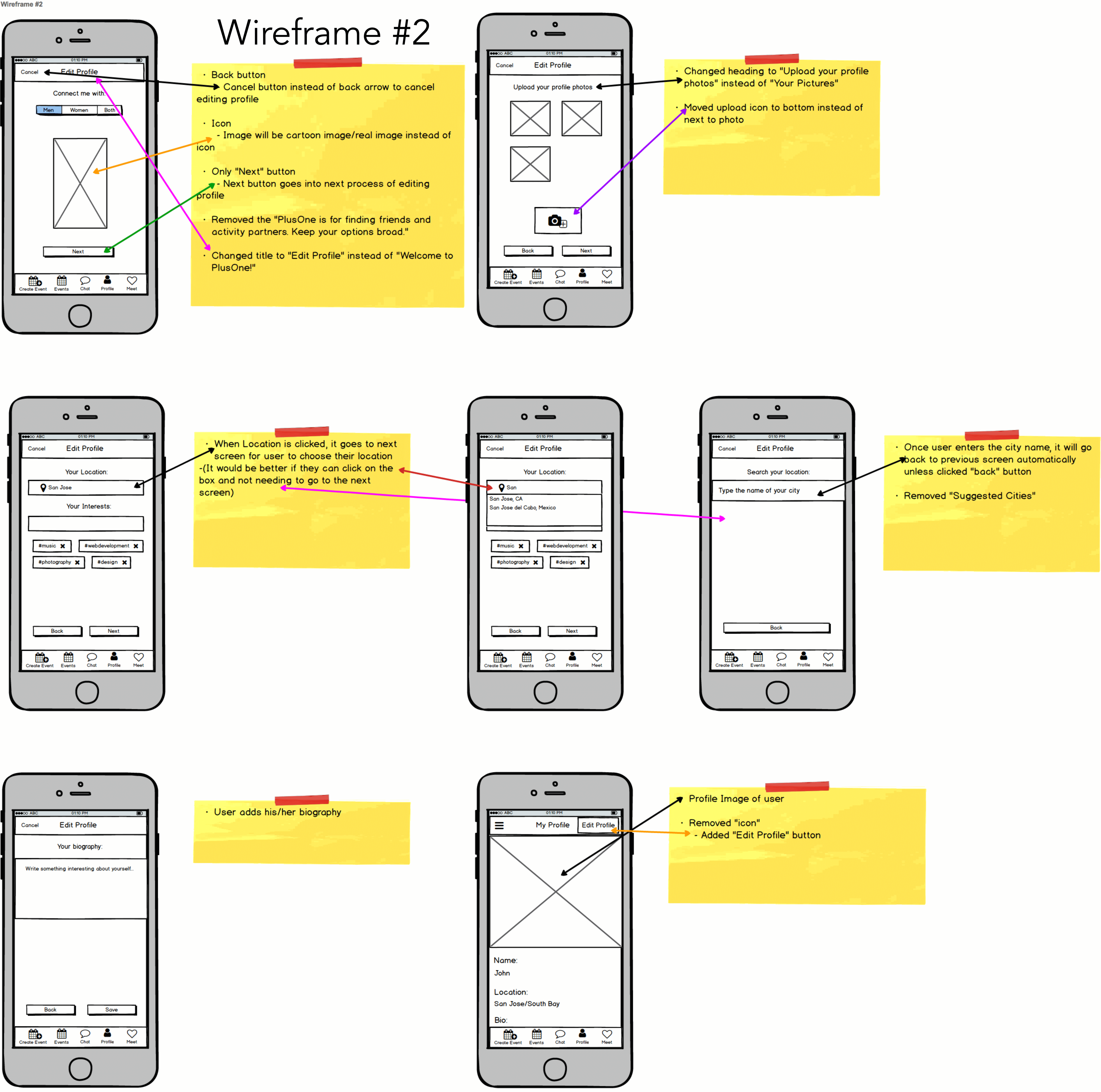
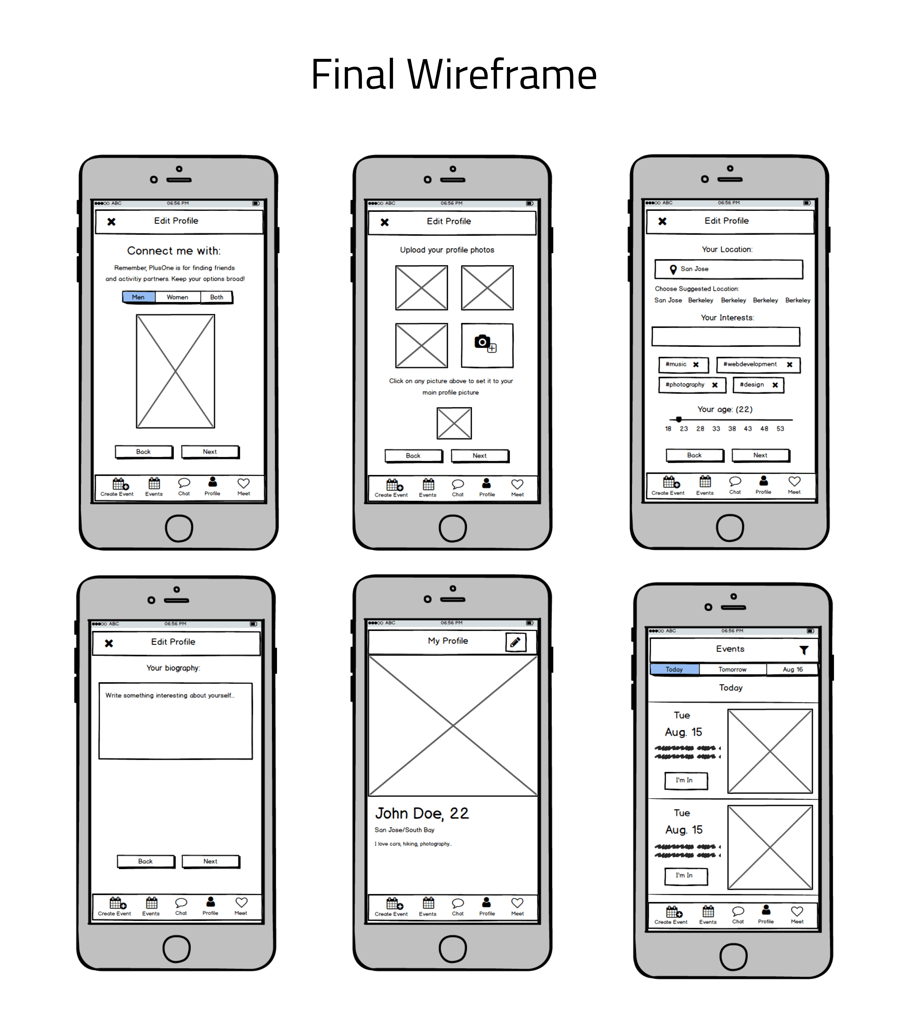
I started wireframing and designing the app
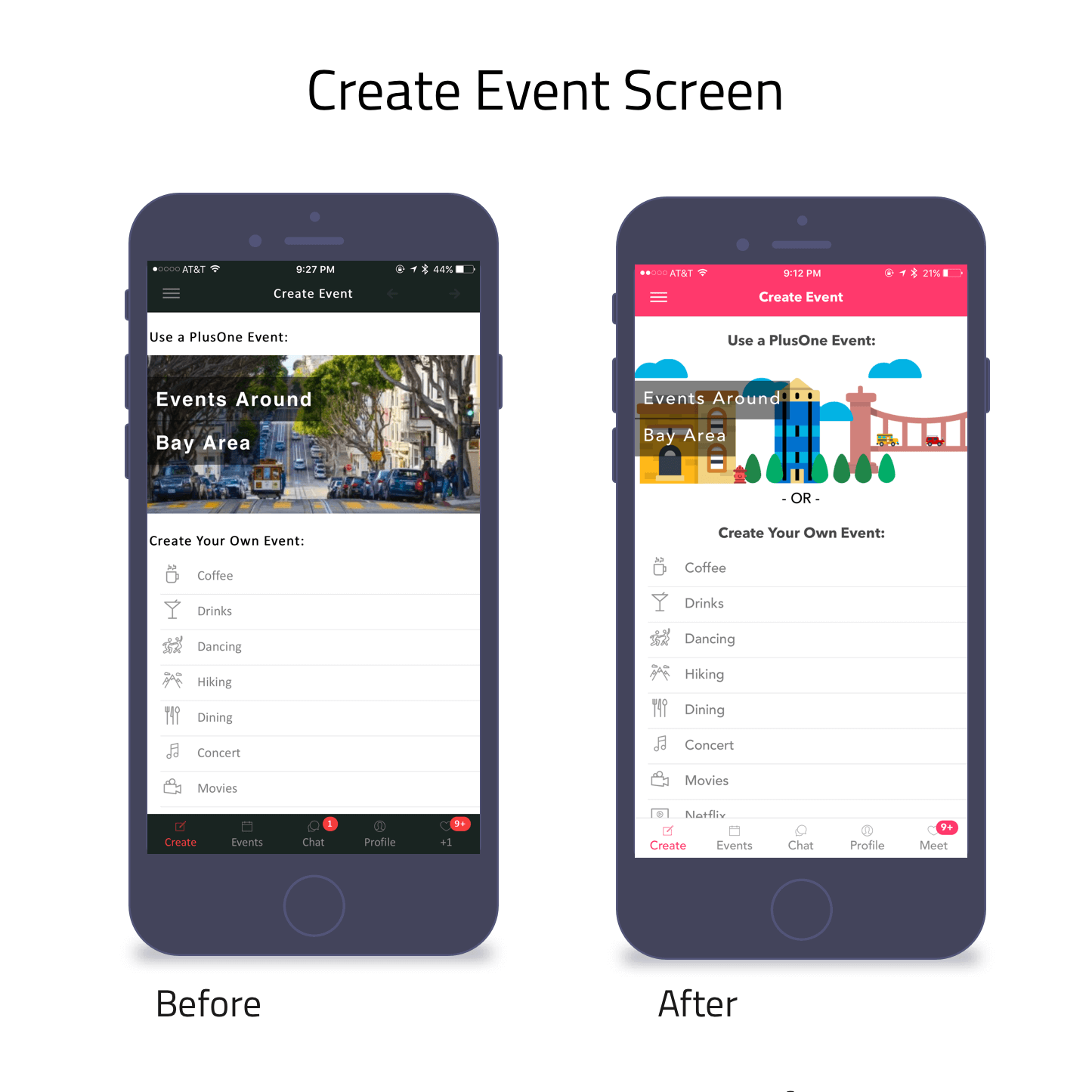
- on "Create your own Event", I would organize the options by alphabetical order, thus making it easier for people to find an option
- remove "Use a PlusOne Event" since that isn't "creating" the event, it's "attending" an event that's already been created; thus, I would move that section to "Events" screen
🚩 What I would change:
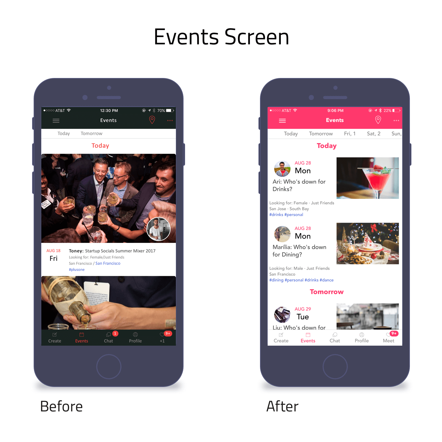
- on the horizontal scroll of the days, I would highlight which day I am on (e.g. If I am on "Today", there would be an indicator letting me know I'm on "Today")
- add a filter icon that allows people to filter days, types of events, age, etc.
🚩 What I would change:
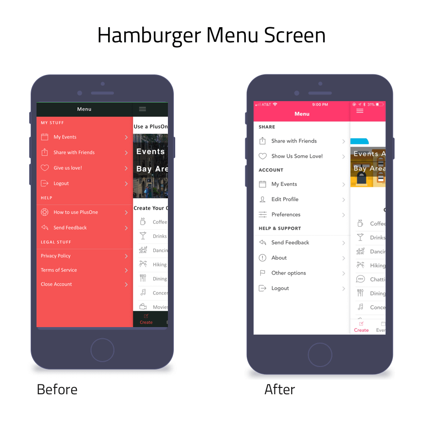
- removing hamburger menu completely since it's most likely to be "missed" by people, and move all that information to "Profile" screen
🚩 What I would change:
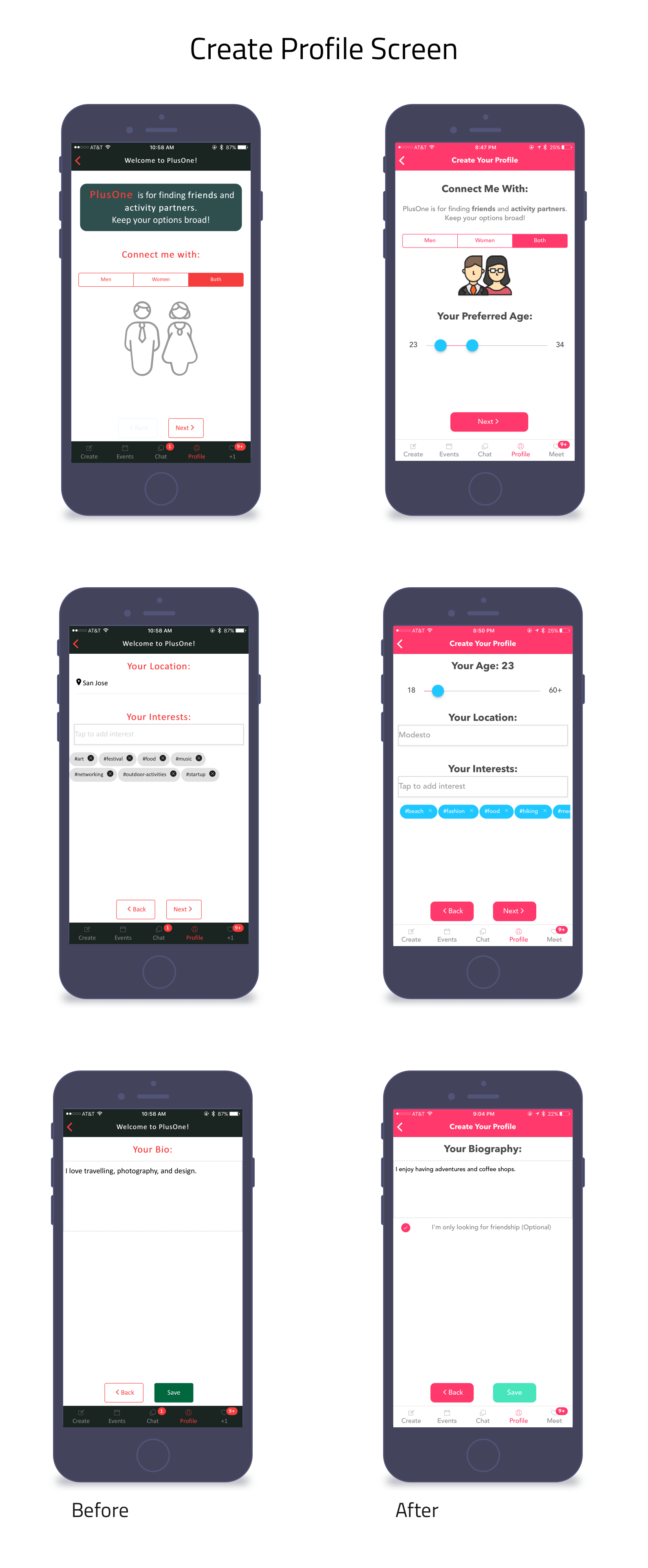
- remove the bottom navigation, thus allowing people to focus on creating their profile instead of exploring outside the screen
- there are 2 call-to-action buttons, so change the back button to outline button instead of filled in
🚩 What I would change:
Key Learnings
🏁 I wish I was able to understand my goal a lot more, as well as conducting interviews with our users to better understand the problem.